
Researchers and developers commonly use Pipeline Pilot, particularly in pharmaceutical, biotech, and chemical industries. Users of Pipeline Pilot can manage and analyze complex scientific data by integrating data from multiple sources (e.g. databases, file systems, and third-party applications) and creating customized scientific workflows. Pipeline Pilot also provides collaborative tools for users to work together on research projects, where they can share data, develop standardized protocols, and execute end-to-end workflows across their organization.
This blog will demonstrate how to build, test, and use a predictive model with Pipeline Pilot on the Titanic dataset, a well-known public dataset available on kaggle.com.
Examining the Data and Building a Model
Three datasets are available as CSV text files on kaggle.com:
- The training set: Train.csv
- The test set: Test.csv
- An example submission set for the Kaggle competition: Gender_submission.csv.
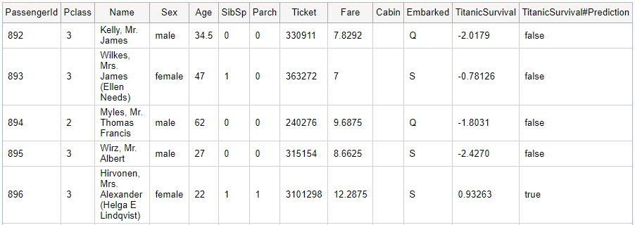
Pipeline Pilot can quickly read these files. The training and test sets include various attributes describing the passengers, such as their names, ages, fares, classes, etc. These attributes are described here. The training and the test sets are the same, except that the training set also provides information on whether the passenger had survived or not. The goal of the Kaggle competition is to predict the outcome using the test set.
Before we get to that, we would like to examine the data, see if there are any issues to fix, and make basic predictions using Pipeline Pilot.
Examining the Training Set
The first step in understanding the training set involves reading and viewing it. We have already downloaded the files from Kaggle. These CSV files can be dragged onto the Pipeline Pilot. The client will automatically upload the file to the server and make it ready to read as the start of a new protocol:
In the clip above, the user drags the CSV file from the desktop location and “drops” onto the Pipeline Pilot client. The clients asks where to upload the file, and we have created a folder for the Titanic dataset for that purpose. The client also selects the Delimited Text Reader, which can read CSV files, a type of delimited text file.
To examine the data, we can load it straight into an HTML tabular report. This report shows us the columns and the values for records and offers a simple way to look at the data.
Finding Relationships Between the Variables
You can easily accomplish the task of creating a tabular view of the data using Microsoft Excel. What are other mechanisms available on Pipeline Pilot to examine this data set? One simple way to look at a data set is a “Pairs Plot”. This is a plot for each attribute vs. other attributes. For example, we know that the training set has the Survived attribute, which you can think of as True/False or 1/0. What happens if we plot Survived vs. Age? The pairs plot will plot all attributes against other attributes. Text attributes are categorized with integer values.
We can insert a component here to generate the Pairs Plot. We can search the thousands of components, which are the building blocks for Pipeline Pilot protocols, to find the R Pairs Plot component. As the name suggests, this protocol uses the R Stats library, which is integrated into the Pipeline Pilot.
The plot generates a nice summary of the data. The plot can be read down the diagonal, which identifies the attributes. To the right and above the diagonal, we see a scatter plot for the attributes identified below and to the left of that graph.
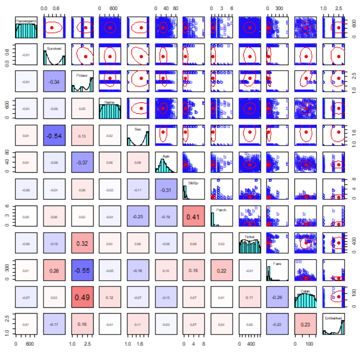
For example, the first row describes PassengerId. The first cell in that row plots PassengerId vs. Survived. We see no relationship between the two components here. In fact, since PassengerId is not meaningful, it would be best to remove it from the plot.
However, if we look along the second row (Survived), the first cell shows the plot of Survived vs. PClass (short for passenger class). We see a negative relationship here; whereas PClass increases (1st to 2nd to 3rd), the survival rate decreases. The red oval shows this trend, which describes an overall negative relationship. The corresponding cell below the diagonal (left and below) confirms the negative relationship with the -0.34 value, which is the slope of this line.
We see that Sex is present with two arbitrary values. We don’t know which bar is which, but we can see that one gender is present in the data at a rate of almost 2 to 1.
Deriving a New Attribute
As we have seen, the “Pairs Plot” offers a compelling way to quickly assess data and make basic inferences. We would like to ignore some of the other attributes. We have already mentioned that PassengerId conveys no real meaning. Similarly, Ticket number is unlikely to give us any information to help make predictions. Additionally, since the names of passengers are unique, we can ignore those for now. Finally, although Cabin might give some useful information (cabins are named according to the deck), we can ignore those for now, too. We can ask the R Pairs Plot component to ignore these attributes.
We already mentioned that Sex has values of “male” and “female”, and these are given integer values. What if we wanted to add these values ourselves, so that we know which was which?
PilotScript is a simple language which can be used in Pipeline Pilot to perform basic operations. In this case, we can assess the value of the Sex attribute. Where a value of “Male” is seen, we’ll replace this with 1, else we will use 2.
The new pairs plot produced now correlates with Sex and other attributes, as before, but now we know which bar is which. There is a 2:1 men to women ratio in the training set.
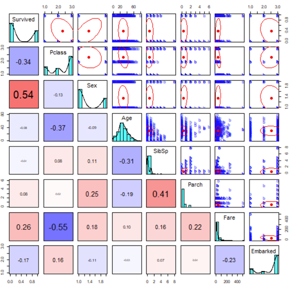
What we see from this is that as Sex increases (recall that male is 1 while female is 2), survival also increases. This makes sense since the expression “women and children first” is closely associated with the Titanic disaster. Indeed, one of the strongest relationships seen is between Survived and Sex – very closely behind PClass which has a strongly negative correlation with Sex.
Building a Predictive Model
Can we use this data to build a model to predict survival in the test set? To do this, we will take part in the training set (where we know the survival status for each record), and build a model. We can then test that model using the remaining training set – we know the answer, but we will see whether the model agrees.
Once we assessed the viability of the model, we can then use it on the real training set, where we don’t know the survival rate. Thankfully, we can find the names of the passengers who survived vs died with a quick search on the internet, so we can find out how well the model performed!
But, let’s start at the beginning.
The data can be split randomly. In this case, we leave out 25% of the data and build the model from the remaining 75% (other methods are available here). The Learn Good from Bad component builds a two-class Laplacian-modified Bayesian categorization model. To build the model, the component must understand how to distinguish “good” (in this case, survival) from “bad” and give it a name. We can determine this by using the Survived attribute, which has a value of 1 when the passenger survived.
The summary table is shown at the end of the calculation, so we can try and understand what the model might be telling us. The first, and therefore the most significant, attribute is Sex.
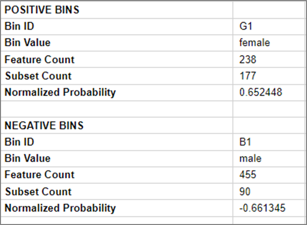
We see a summary of the “bin”. In this case bin G1 (good), we see 177 or 238 were in the “good” subset (survived). Therefore, with just this information, we have a probability of survival of around 0.65 or 65%.
The opposite is true for the male passengers, where 90 out of 455 survived, telling us we have a -0.66 probability. This means we have a strong chance of not surviving, or around 66% chance.
On the other end of the scale, have you noticed that we didn’t attempt to remove PassengerId? That is because the predictive model will effectively do it for us. PassengerId becomes the least predictive attribute, confirming that these numbers were assigned in an arbitrary manner.
Testing the Model
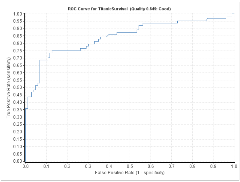
We have seen that we built a model, but how do we know if it is predictive? There are various ways to see how well our model performs. For now, we’ll use a Receiver Operating Characteristic or ROC plot. We kept back 25% of our data for just this purpose.
The model is now built from the previous section, so here we take the failing 25% from the randomly selected training set, which includes information on who survived and who did not. We no longer need the model-building component, so we copy the details we need from the component and show the ROC plot.
The area under the curve indicates predictability. If the selection of survival was random, we would expect to see a diagonal line (0.5 area). In this case, the area is 0.845, which indicates that the model performed well.
Using the Model
The model is a new component. As such, we can read the test set, which has the same attributes as the training set (minus the Survived attribute), so we can make our predictions using this model.
The model supplies a probability of survival and an overall prediction. Did the passenger survive?
A quick search of the internet reveals:
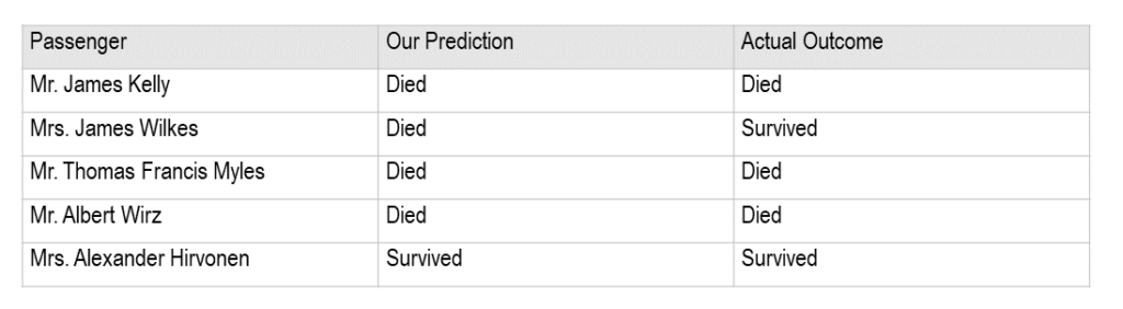
We didn’t do too badly. In one case, where our prediction was wrong, the probability was less conclusive compared to the others, implying the model was less certain about this victim’s fate vs other victims.
But some predictions could not be made. Why?
In this case, data required by the predictive component, i.e. the age, was missing, so no prediction could be made. But, we can do better with Pipeline Pilot even when there is missing data. We show how to enhance data in part II of this blog.

Saving Work
We may prefer to save our protocols as we move along this process. The pairs plot seems useful for doing so; therefore, we will keep a copy of the process that built the protocol for later
Protocols can be saved to the user’s tab that is only accessible to that user. Alternatively, they can be saved to the Protocols tab, where all users on the system can use them. The protocol has a name, but can also have a title and a full description.
In this first part of this blog, we demonstrated how Pipeline Pilot can read data from a source, examine the data to create a predictive model based on the relationship between relevant attributes, and identify any errors in the data leading to inaccurate or lost predictions. In Part II of this blog, we will demonstrate how to enhance the dataset to improve our model.
If you are curious to learn more about Pipeline Pilot and its applications:

Read: Modeling the Titanic Data Set Using BIOVIA Pipeline Pilot Part II

Phil Cochrane has a PhD in organic chemistry, specializing in the synthesis of indole alkaloids, and has amassed over 20 years of experience working with Pipeline Pilot as a services consultant, both independently and as part of Accelrys, where his expertise in chemistry has been highly valuable and earned him a reputation as an industry expert.